(Ver. 1.10)
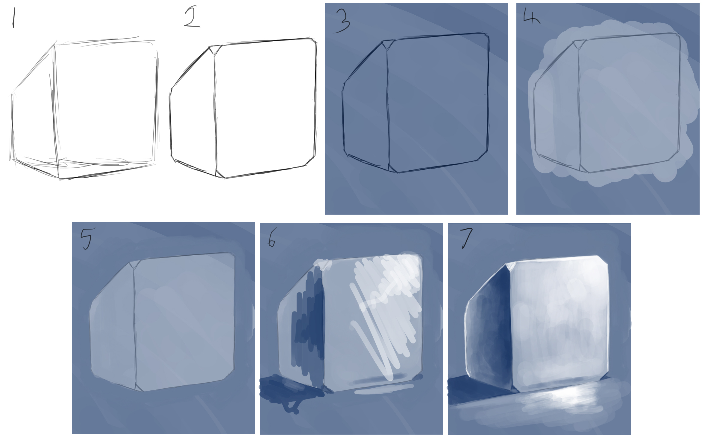
Hello, I am M-Maher also known as Mark Maher (my real name) and Verbank Sleyher (my stage name), if you like my art and enjoy the style of it then you're in luck, today, in this post I'm going to show you around how I make the things I make, now this isn't going to go into any design ethics I think I'll save that for later, instead I'm going to illustrate to you how my art is made, below you'll see an image, it is my process broken down into 7 different stages, and below that are explinations on each stage, I made this tutorial not as a decliration of "this is how you are supposed to make art" but rather I want this to be something that I can use to communicate my style to other artists and allow them to understand where I come from in an artistic sense.
NOTE: If you choose to follow this please know I do my art in photoshop CS5

-
Framework Sketch
The framework sketch is simply the base sketch that establishes what the image is going to look like, in this stage I abstain from any detail and sketch the image out quickly, this is so I may encourage myself to actually finish the drawing as it works as a guide for the finished product and doesn't leave me stopping and starting every so often to work out how something will look.
-
Design and Detail
After the first stage I begin to finally clean up the linework and add in little details here and there like panel lines or armour segments and other such features, I also try to define shapes that were drawn in the first stage and work on them more to be what I want them to be.
In this stage while drawing robots and mechs I go through many different head designs until I find a design I like, additionally I remove any lines that do not make sense in terms of perspective and I eliminate any segments that I consider too much design, I like to make things simple.
-
Enviromental colouration
Using opacity 75% over a white background with a colour I go over the entire image, the reason I do this is because the colouration of the enviroment you're painting will effect your colour palette so going over it first with a colour of the same hue will allow you to effect the colours your using without mixing (given you're using pressure sensitivity and opacity) this speeds up painting the image as you can use the background to your advantage instead of having to figure out what colour would fit where.
-
Object, scene and character colouration
In this stage I go over features in the picture with colours I want them to turn out as. the process is done in a hurry, I ignore shading as that is for stage 6 and 7 and I ignore edges as the entire segment is supposed to be of that hue and since the circle paint brush is not very good at tackling corners I am forced to scribble outside the lines to get the effect I want.
Thanks to stage 3 the colours will be more uniform given that they're applied properly, this means applying with opacity on, previously I used to go over an entire character/object with black if they were up close to the "camera" and then apply the colours, if you feel this helps you out then have a go at it, personally I stopped doing it out of both lazyness and my "no black for shading" rule which dictates that I avoid black like a plague, I do this simply because a darker colour has a better look to it than black.
-
Clean up
Cleaning the image after colouration is needed since, as stated in stage 4, I have to go outside the lines to get the effect I want, during cleaning I can again make lines more defined but this time with colour.
Stage 6 can usually be started on certain segments as cleaning is finished on them and I usually work in stages 5, 6 and 7 at the same time as a time saving technique.
-
Shading
like in real painting I usually plot out where shade is and reflection is with just plops of colour quickly dabbed in place, this works to setup for stage 7and also distinquishes light direction and confirm that the colours chosen for the darks and the lights work well with the already established colours.
-
Blending and highlights
The final step is blending the colours from stage 6 and adding highlights and colour reflection to the image, I enjoy this part the most however it is the most time consuming of the 7 stages and can become a bit of a chore as time goes on, this stage gives the image real shape and perspective as opposed to the first 2 stages and actually makes the image seem real (in a sense) and gives it that 3D quality.
Void
Cool, thanks man, if I decide to use photoshop at some point I'll definitely use this.